SharePoint sections are used to layout pages and up until now we haven’t had the ability to control where webparts are positioned. The new Flexible Sections give content creators the ability to position webparts and resize within the section.

To add a Flexible Section, edit your page and add a new section, then choose Flexible.

You cannot add webparts directly in a Flexible section, so add them to a section outside the Flexible section first and the drag the webpart in to position. Once this is done you can resize the webpart by dragging it on the canvas to the position you want and using the resize bars on the left and right of the webpart. You can also use the resize pill at the bottom right of the section to adjust the height.

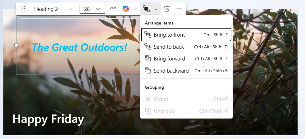
Webparts can be reposition and grouped within the section. This is great if you want to have text content over an image and need more flexibility that the built in webparts provide. In this example I have a text webpart using the “pullout” text style, I’ve adjust the font size and colour and positioned the webpart over a News webpart.
Here are some tips for creating a good page layout:
- Be consistent in your page structure. This helps the reader to comprehend your page content, especially when reading content throughout your site or Intranet.
- Think about the responsiveness of the page. How will this look on different screen sizes and devices. This is especially important if you have high usage on mobile devices.
- Find a balance between visual appeal and functionality.
- Consider accessibility when you design the page structure. Use the SharePoint Accessibility Assistance to help you.
This is great improvement and people with much better design skills that me will now have the ability to customise Intranet and content pages more than ever before.
Flexible sections are rolling out to SharePoint Online now. I noticed this show up in my work tenant last week.
Discover more from SharePoint Moments
Subscribe to get the latest posts sent to your email.
